10.27.2010

I changed the color.


The crimson felt too expected, and the purple/silver combo felt too feminine.

10.26.2010

by the way...


which color scheme reads better?
I feel like the red helps the viewer to visualize "mad" more...but I really do like that silvery purple. (it's a metallic pantone)

new color and placement


....but before the government warning.

10.25.2010

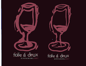
logo work in progress pt.2


The concept behind the wine glass came from blind contour drawings with a brush pen. Basically the globe of the glass ended up being drawn twice, and they are slowly overlapped (one has wine in the glass and one doesn't). The main idea behind this bottle is the madness shared, so I wanted the glass to be drawn rather...not sane, and the number 2 is very important with the brand name (hence the two overlapped wine glasses).

After getting the opinion that the original bottle was too thick and bulky, I tried to scale the lines down a tad -- that is the result.


different color scheme?

10.21.2010

wine bottle in progress?


I'm not necessarily happy with this yet. In fact, the top photo is a menagerie of different thoughts coming together on one bottle so I am aware of the lack of flow.

Until I figure out my logo (sigh), I can't really decide which box shape I would like to go with.

THINGS I DO KNOW:
1. My wine brand is Folie a Deux, which means, "madness shared between two people," or "shared fantasies."
2. I want to take these meanings and create a feeling of loopy, drunk madness on my wine bottle.
3. There are going to be two 375mL bottles in my packaging, to represent the shared madness.
4. I am using a black board for my box with a brushed silver inner color, and using deep crimson and dark plum purple as my splashes of color. These colors represent not only the colors of red wine, but also give the feeling of dark, seductive elegance (mixed with slightly off type, I feel like I may be hitting the mark that I want.)
5. The madness that I am trying to achieve is not an insanity madness (ie- Ransom type) but more like Alice in Wonderland mad.

This is my bottle:

10.14.2010

mad text test

Does this type look effectively "mad," twisted and sideways, or does it just look retarded?
It will be placed on the back of my wine bottle and may even twist around the side of the bottle.

10.13.2010

10.12.2010

Some Cool Table of Contents pages

For anyone who needs the inspiration for Laura's class tomorrow.


Creative Brief - Wine Bottle

Client:
Folie á Deux Winery

Objective:
Redesign logo, bottle design, and package presentation

Overview:
The Folie á Deux wine bottle as it is now is extremely plain for no reason. There is simply a line of type for the logo, a small icon below, and the type of wine listed at the bottom. The plain cream-colored label does not allow this wine to showcase itself on a shelf full of other brightly colored, intricately designed wine bottles.

Redesign:
For my redesign, I plan to take the literal meaning of Folie á Deux, which is “a madness shared between two people,” and twist the color scheme and focus of the label to a slightly darker and sideways place. I would like the information and graphics to be placed on the bottle via transfer, and areas of the glass will be frosted over for a different look and texture. For the packaging itself, I will further push the idea of having something shared between two people by packaging two half-sized bottles together and allowing the
graphics to flow back and forth between the two bottles as they sit beside one another. With this idea, not only do the bottles share the illustrations, but the consumers share the wine by having their own unique bottle out of the same gift package.

Visual Themes:
I plan on using bolder colors for this redesign, dipping into brighter and darker reds, greens, and purples. Lines will be not quite straight to feel a little mad, and where soft, organic lines may once have been, they will be replaced with pointy edges and off-centered focuses. The surface of the wine bottle will be a place in the mind where you go when you are mad, and maybe even slightly drunk from the tannens of red wine.

10.10.2010

Personal Workspace

This is my desk. There is no space for my computer because my printers take up all of the countertop and there are layers of nonsense on top of them.

This is my bookshelf. There are design books on the second row up.


This is my drawing table that I have since deemed as my cutting table. There are always scraps on the table from the last time I mounted a board, and there is always at least one of my cats in that window. I happened to catch my two kitties in the window at the same time, which is rare, since they hate each other.


And this is my dining room table. It is rarely used to actually eat on, since I am barely at home between work and school. Instead, it is my catch-all surface for bags, keys, school stuff, art products, and other random things. I usually have a vase with flowers on it, but on this day, my cats knocked over the vase and got water everywhere, so I had to move it to my kitchen. When I have a lot of projects to work on, I plug my laptop into the wall behind my chair and sit for hours working on the computer here. Sometimes I have a kitty in my lap, and when she gets tired of that, she will move to sit on my keyboard.