11.30.2010

SERIFS! ...again.

Y

SERIFS!

The title of my calendar is THE JOY OF THE SERIF, a calendar celebrating thirteen notable serif typefaces in the design world. Each month has a small paragraph describing the typeface's history and briefly describing its unique parts.

This idea came to me because I was looking back at my most recent projects and realized that I have been using nothing but serif typefaces for a while. I think they are extremely classic and beautiful, and there are so many different little nuances between each typeface that I felt the need to explore more with and highlight to others that may not see them either.

This calendar will be bound at the top and packaged in an easel kind of way, so it could sit on someone's desk and one could flip back and forth between the months as needed while learning more about the history of (serif) type. I also wanted to showcase the ampersand in each typeface because I feel like that is the most beautiful character in many typefaces.

THERE IS NO COLOR YET... I haven't even begun exploring that aspect, but I wanted to post the layout of a couple that I am fond of at this point in time.

I like where this is going but I know I have a long way to go before it is a finished product.


EDIT: After seeing these cropped the way they would be printed (ie- serifs getting cut off at the edges), i decided that i absolutely hate it with a passion....especially since I am cutting off the very thing this calendar is celebrating. So I will fix it (ie-make it smaller and not hang off the edge) and update the progress.

11.29.2010

Favorite Album Art

manchester orchestra - mean everything to nothing
I like how type is the design. You can't help but notice it on a shelf.


incubus - monuments and melodies
This drawing style is very unique to the members of the band that created it. It shows that line art mixed with a little color can be moving and tell a story.

the shins - so says i (single)
There's something about all the abstract color that is picasso-esque. It's quite beautiful. If this is what my art director wanted me to make, I'm not sure where I would begin.

bright eyes - LIFTED [or] the story is in the soil, keep your ear to the ground
I like how this cover feels like an old, antique book that has been handed down from family member to family member. Something about it feels classic and precious.

brand new - deja entendu
The epic background coloring is really beautiful and jumps off shelves.


radiohead - hail to the thief
I love all of the hand rendered type and its location in the cover.

MGMT - time to pretend EP
The illustrations and color are very playful. I enjoy looking at all the details.

the flaming lips - yoshimi battles the pink robots
If someone told me to draw a pink robot, I don't think I would have come up with one this dynamic and fun. It would be a fun project to see what people would create if you asked them to draw a pink robot.

11.18.2010

can't find your phone?

For those of us that don't have that fancy Droid service that calls our phone when it's lost...

I thought this was a beautiful webpage, in addition to its functionality.

http://www.icantfindmyphone.com/

absolutely beautiful.


11.17.2010

Blog #7

Each week I feel as though I must check in with:

Twitter
Not just to see what other friends are doing, but I follow AIGA, Behance Network, GOOD Magazine, and many other design related organizations that are constantly posting links to very interesting sites and articles, as well as beautiful designs.

Behance Network
I love looking at the most recent works created by people in the field. It's a great browsing site for inspiration and beautiful traditional art mixed with computer arts.

Class Blogs
Seeing what other classmates are posting keeps me motivated to do my own design.

The Dieline
Package design is very inspirational to me and I enjoy looking at the most recently posted designs from this site.

NotCot.org
Another inspiration website. This encompasses basically anything artistic around the world, not necessarily just graphic design. There are interior design pieces, photos, package designs, and general creative beauties.

11.06.2010

magazine photo shoot 1


Here is a preview of what today's photo shoot with Dana looked like.

The theme of today's shoot was to bring in the essence of fall with the feeling of reading a good book. Nature meets writing. You know, that whole Whitman and Thoreau thing.

10.27.2010

I changed the color.


The crimson felt too expected, and the purple/silver combo felt too feminine.

10.26.2010

by the way...


which color scheme reads better?
I feel like the red helps the viewer to visualize "mad" more...but I really do like that silvery purple. (it's a metallic pantone)

new color and placement


....but before the government warning.

altered type from before

10.25.2010

logo work in progress pt.2


The concept behind the wine glass came from blind contour drawings with a brush pen. Basically the globe of the glass ended up being drawn twice, and they are slowly overlapped (one has wine in the glass and one doesn't). The main idea behind this bottle is the madness shared, so I wanted the glass to be drawn rather...not sane, and the number 2 is very important with the brand name (hence the two overlapped wine glasses).

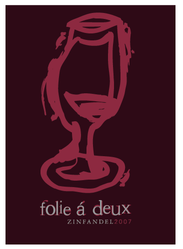
After getting the opinion that the original bottle was too thick and bulky, I tried to scale the lines down a tad -- that is the result.


different color scheme?

10.21.2010

wine bottle in progress?


I'm not necessarily happy with this yet. In fact, the top photo is a menagerie of different thoughts coming together on one bottle so I am aware of the lack of flow.

Until I figure out my logo (sigh), I can't really decide which box shape I would like to go with.

THINGS I DO KNOW:
1. My wine brand is Folie a Deux, which means, "madness shared between two people," or "shared fantasies."
2. I want to take these meanings and create a feeling of loopy, drunk madness on my wine bottle.
3. There are going to be two 375mL bottles in my packaging, to represent the shared madness.
4. I am using a black board for my box with a brushed silver inner color, and using deep crimson and dark plum purple as my splashes of color. These colors represent not only the colors of red wine, but also give the feeling of dark, seductive elegance (mixed with slightly off type, I feel like I may be hitting the mark that I want.)
5. The madness that I am trying to achieve is not an insanity madness (ie- Ransom type) but more like Alice in Wonderland mad.

This is my bottle:

10.14.2010

mad text test

Does this type look effectively "mad," twisted and sideways, or does it just look retarded?
It will be placed on the back of my wine bottle and may even twist around the side of the bottle.

10.13.2010

10.12.2010

Some Cool Table of Contents pages

For anyone who needs the inspiration for Laura's class tomorrow.