


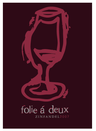

The concept behind the wine glass came from blind contour drawings with a brush pen. Basically the globe of the glass ended up being drawn twice, and they are slowly overlapped (one has wine in the glass and one doesn't). The main idea behind this bottle is the madness shared, so I wanted the glass to be drawn rather...not sane, and the number 2 is very important with the brand name (hence the two overlapped wine glasses).
 After getting the opinion that the original bottle was too thick and bulky, I tried to scale the lines down a tad -- that is the result.
different color scheme?
No comments:
Post a Comment